Sparky

SERVICE

INTERNAL TOOL

ROLE

DESIGN
LOGIC

PROJECT TYPE

Product design
AI CODING
As part of Spark No. 9's client projects, we always began with a two-hour workshop to gather stakeholder inputs. These workshops were tough to schedule, often involving back and forth with participants before a time could be set, and the sticky notes they produced still had to be synthesized afterwards.

Working with the team, I designed Sparky to replace the workshop with an independent digital exercise. Clients provide their input asynchronously, which lets Spark reach more stakeholders than a single meeting ever could, and frees up the time a live workshop and manual synthesis used to take.
I designed Sparky's three exercises, positioning, audience, and creative, all built to be quick and easy to fill out. Every client is invited to complete all three, regardless of role or expertise.

I also wrote the backend logic that turns client input into testable positions and creative directions. It works to keep every variable distinct, while surfacing points of alignment and disagreement across responses.

The impact:

  • Speed: Client inputs collected asynchronously. No need to schedule a workshop.
  • Reach: More clients can provide inputs.
  • Unfiltered: No  senior voice in the room, so everyone's input carries equal weight.
  • Cost: Less of our time means a lower fee.

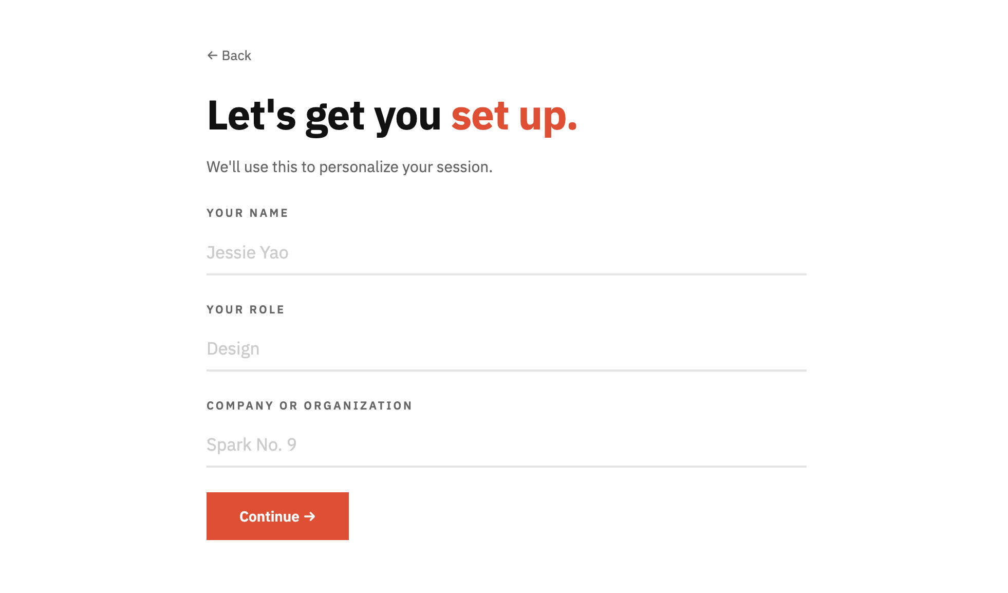
Text reading 'Powered by Sparky' with a lightning bolt icon above bold text saying 'Your product is ready. Let's figure out how to launch it.' Below is an orange 'Get Started' button with an arrow.Setup form page with header text 'Let's get you set up.' with fields for name, role, and company, pre-filled with Jessie Yao, Design, and Spark No. 9, and a red 'Continue' button.
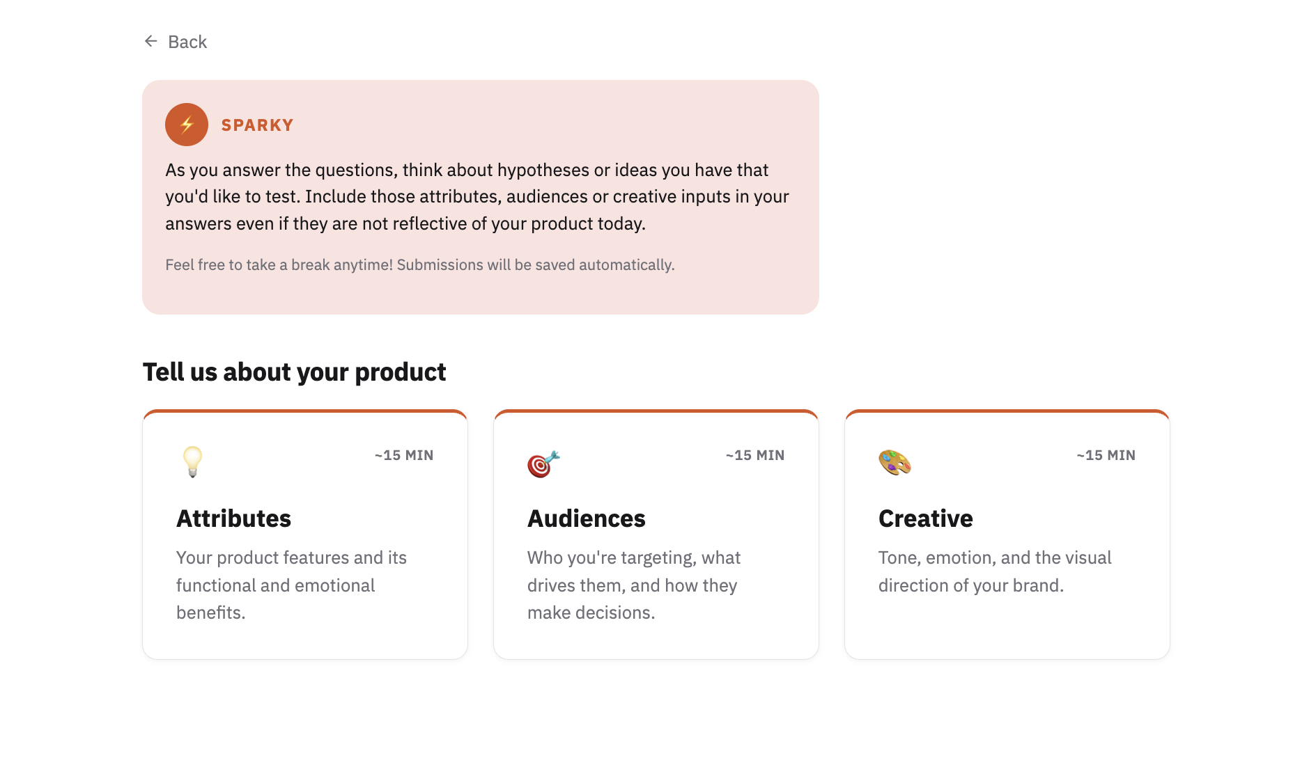
Website interface with a Back arrow and a Sparky message box encouraging users to think about hypotheses and creative inputs when answering questions. Below, a section titled 'Tell us about your product' features three cards labeled Attributes, Audiences, and Creative, each estimated to take around 15 minutes. Attributes card has a light bulb icon and describes product features and benefits. Audiences card has a target icon and describes target audience motivations. Creative card has a paint palette icon and describes tone, emotion, and brand visual direction.
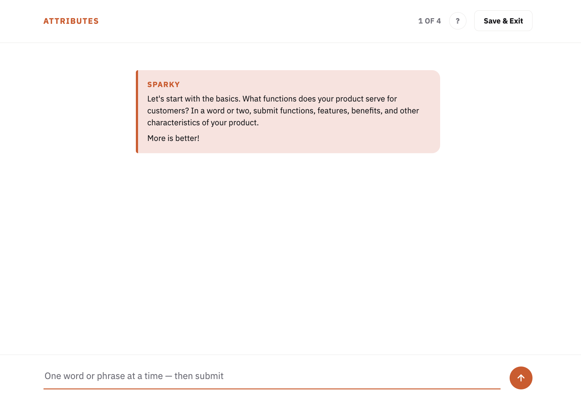
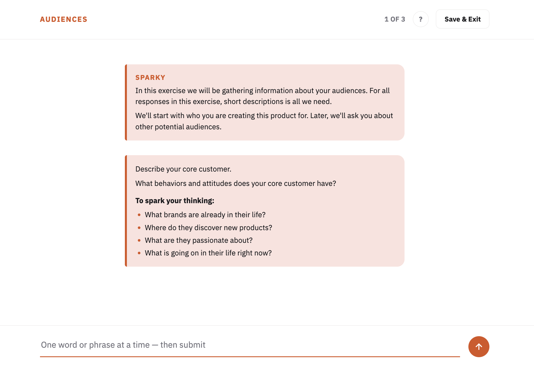
Screenshot of a product attributes input interface titled 'ATTRIBUTES' with instruction from Sparky asking the user to submit product functions, features, benefits, and characteristics, emphasizing 'More is better!' There is a text input field at the bottom with placeholder text 'One word or phrase at a time — then submit' and an orange submit button with an upward arrow.Webpage titled AUDIENCES showing a prompt from Sparky asking users to describe core customers, their behaviors and attitudes, with guiding questions about brands in their life, product discovery, passions, and current events. Text input field labeled 'One word or phrase at a time — then submit' is below the prompt. Navigation shows '1 OF 3' and buttons for help and Save & Exit at the top right.
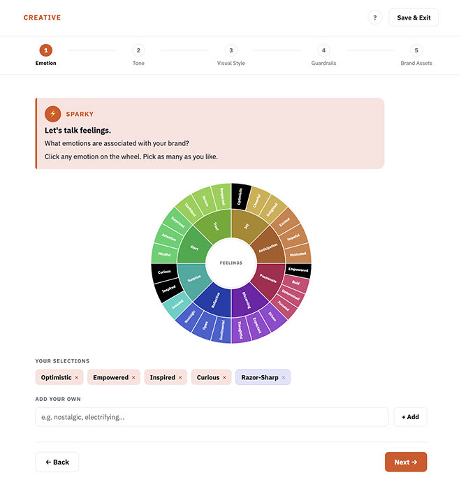
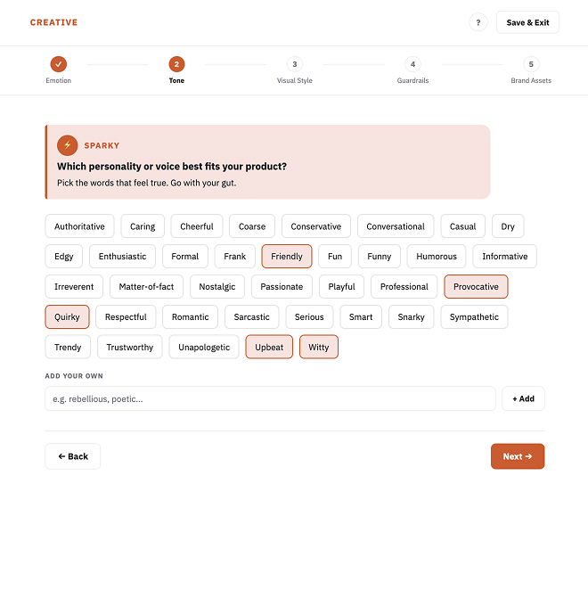
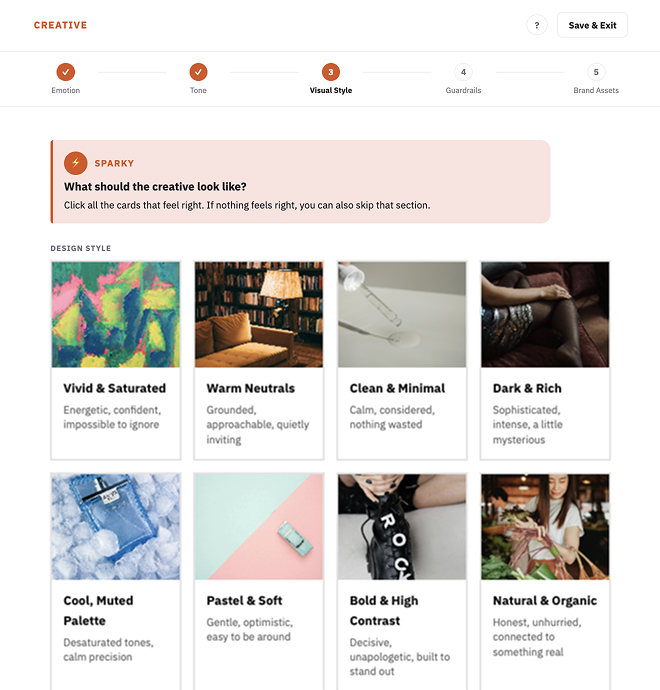
User interface titled CREATIVE showing a multi-step process with five steps: Emotion, Tone, Visual Style, Guardrails, Brand Assets; the Emotion step is active. A circular emotion wheel is displayed in the center with color-coded segments labeled with feelings like Optimistic, Empowered, Inspired, Curious, and Razor-Sharp. Selections of these emotions appear below the wheel with close buttons for removal. Above the wheel is a pink highlighted section titled SPARKY with text prompting users to pick emotions associated with their brand by clicking the wheel. A text box and Add button let users enter their own emotions. Navigation buttons labeled Back and Next are at the bottom right and left.User interface for selecting a product personality or voice tone labeled Sparky with instruction: Which personality or voice best fits your product? Pick words that feel true. Words like Authoritative, Caring, Cheerful, Coarse, Conservative, Conversational, Casual, Dry, Edgy, Enthusiastic, Formal, Frank, Friendly, Fun, Funny, Humorous, Informative, Irreverent, Matter-of-fact, Nostalgic, Passionate, Playful, Professional, Provocative, Quirky, Respectful, Romantic, Sarcastic, Serious, Smart, Snarky, Sympathetic, Trendy, Trustworthy, Unapologetic, Upbeat, and Witty are displayed in boxes. Friendly, Provocative, Quirky, Upbeat, and Witty are highlighted. There is an input box to add own words and buttons labeled Back and Next.User interface titled 'CREATIVE' showing a multi-step creative briefing process with steps Emotion, Tone, Visual Style, Guardrails, and Brand Assets. Step 3 Visual Style is active, with instructions under a pink 'SPARKY' banner asking what the creative should look like and inviting users to select cards. Eight design style cards are displayed: Vivid & Saturated (energetic, confident), Warm Neutrals (grounded, approachable), Clean & Minimal (calm, considered), Dark & Rich (sophisticated, intense), Cool Muted Palette (desaturated, calm), Pastel & Soft (gentle, optimistic), Bold & High Contrast (decisive, unapologetic), and Natural & Organic (honest, unhurried). Each card includes a representative image and descriptive keywords.
Cover image showing DIG logo.

Next project

Arrow pointing right